Introduction
Welcome to the matrics_calculator package documentation! This package provides various useful method for calculating predictive model performance metrics that’s used across Data Science studies.
Below we’ll walk you through using the various functions within this package along with providing example for each function. Before continuing with the examples below, confirm that you have vega-datasets installed as we’ll be using the countries data set from this package. If you don’t have it installed, you can do so by putting pip install vega-datasets into your terminal. After installing vega, run the cells below in order to import the data set and use the functions.
Step 1: Load the Dataset
We will first import the countries dataset from vega-datasets.
import pandas as pd
from vega_datasets import data

# Load the countries dataset
countries = data.countries()

# Display the first few rows of the dataset
print(countries.head())
                         _comment  year  fertility  life_expect  n_fertility  \
0  Data courtesy of Gapminder.org  1955        7.7       30.332          7.7
1                             NaN  1960        7.7       31.997          7.7
2                             NaN  1965        7.7       34.020          7.7
3                             NaN  1970        7.7       36.088          7.7
4                             NaN  1975        7.7       38.438          7.8

   n_life_expect      country  p_fertility  p_life_expect
0         31.997  Afghanistan          NaN            NaN
1         34.020  Afghanistan          7.7         30.332
2         36.088  Afghanistan          7.7         31.997
3         38.438  Afghanistan          7.7         34.020
4         39.854  Afghanistan          7.7         36.088
Step 2: Understand the Dataset
The countries dataset includes various features like life_expect, fertility, year, p_fertility and p_life_expect etc. You can choose a numeric column to use as your target variable and other columns as features.
For example:
Target variable (y): life_expect.
Step 3: Preprocess the Data
Now we have selected our target variable and features, it is important to preprocess the dataset by handling the missing values and selecting the features that’s only relevant to the problem at hand.
# Drop rows with missing values in relevant columns
countries = countries.dropna(subset=["life_expect", "fertility", "year", "p_fertility", "p_life_expect"])

# Select features and target variable
X = countries[["fertility", "year", "p_fertility", "p_life_expect"]]
y = countries["life_expect"]

# Display the shape of the dataset after cleaning
print(f"Dataset shape: {X.shape}")
Dataset shape: (567, 4)
Step 4: Split the Dataset
Split the data into training and testing sets for model evaluation.
from sklearn.model_selection import train_test_split

# Split the dataset into training and testing sets
X_train, X_test, y_train, y_test = train_test_split(X, y, test_size=0.2, random_state=42)

# Print dataset sizes
print(f"Training set size: {X_train.shape[0]}")
print(f"Testing set size: {X_test.shape[0]}")
Training set size: 453
Testing set size: 114
Step 5: Train a Regression Model
Use a simple linear regression model to fit the training data.
from sklearn.linear_model import LinearRegression

# Initialize and train the linear regression model
model = LinearRegression()
model.fit(X_train, y_train)

# Make predictions on the test set
y_pred = model.predict(X_test)
Now we have trained our simple linear model, we can use the methods provided in this package to calculate some metrics!
Function 1: r-squared
R-squared score measures the proportion of variance in the dependent variable explained by the model, providing insight into the model’s goodness of fit. Below is an example of how to use the r2 function with our life expectancy dataset and trained regression model.
# Import the r2 function from our custom package
from matrics_calculator.r2 import r2

y_test_r = y_test.tolist() if not isinstance(y_test, list) else y_test
y_pred_r = y_pred.tolist() if not isinstance(y_pred, list) else y_pred

# Calculate r-squared score
r2_score = r2(y_test_r, y_pred_r)
print(f"r_squared score: {r2_score:.3f}")
r_squared score: 0.978
A value close to 1 (e.g., 0.93) indicates that the model explains most of the variability in the data, demonstrating a strong fit.
To better understand how well the model captures the variability in life expectancy, let’s visualize the predictions alongside the actual values.
import matplotlib.pyplot as plt

# True vs Predicted plot
plt.scatter(y_test, y_pred, alpha=0.7, label="Predictions")
plt.plot(
    [y_test.min(), y_test.max()],
    [y_test.min(), y_test.max()],
    "r--",
    lw=2,
    label="Perfect Prediction",
)
plt.xlabel("True Life Expectancy")
plt.ylabel("Predicted Life Expectancy")
plt.title(f"True vs Predicted Life Expectancy (R² = {r2_score:.3f})")
plt.legend()
plt.show()
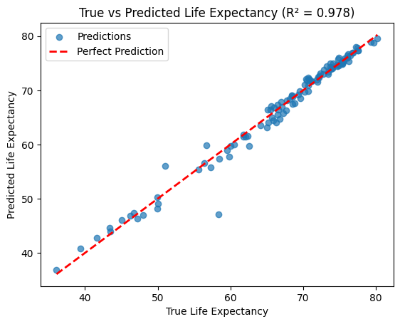
The scatter plot shows the alignment of predicted values with the 45° line, illustrating how well the model performs.
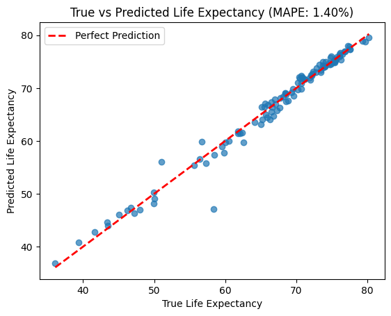
Function 2: Mean Absolute Percentage Error
In the countries dataset, MAPE can evaluate how well a regression model predicts life expectancy (life_expect) based on features like fertility rate, population, and previous life expectancy.
MAPE gives an easily interpretable percentage error, which is ideal for communicating model performance to policymakers or stakeholders who may not be familiar with other statistical metrics. For example, if the MAPE is 8%, you can confidently say that the model’s predictions are off by 8% on average.
from matrics_calculator.MAPE import mean_absolute_percentage_error

# Evaluate MAPE
mape = mean_absolute_percentage_error(y_test, y_pred)
print(f"MAPE: {mape:.2f}%")
MAPE: 1.40%
A low MAPE (e.g., <10%) indicates the model is relatively accurate. A high MAPE suggests the model may not generalize well to the data, requiring further tuning or feature selection. In our case our MAPE calculated is 1.4% which indicates our simple linear model’s predictions are only off by 1.4% on average.
Below is an illustrative plot showing how MAPE helps identify where true and predicted values differ.
plt.scatter(y_test, y_pred, alpha=0.7)
plt.plot([y_test.min(), y_test.max()], [y_test.min(), y_test.max()], 'r--', lw=2, label='Perfect Prediction')
plt.xlabel("True Life Expectancy")
plt.ylabel("Predicted Life Expectancy")
plt.title(f"True vs Predicted Life Expectancy (MAPE: {mape:.2f}%)")
plt.legend()
plt.show()
Function 3: Mean Absolute Error
Predicting life expectancy is a critical task in understanding global health and socioeconomic trends. Using the countries dataset, we’ve built a simple linear regression model to predict life expectancy based on features such as fertility rate, population trends, and previous life expectancy. But how well does our model perform?
This is where the Mean Absolute Error (MAE) comes in. MAE tells us, on average, how far off our predictions are from the actual values in the dataset. It’s an intuitive metric for assessing the accuracy of regression models, especially when working with interpretable values like years.
An MAE value tells us how many years, on average, our model’s predictions deviate from the true life expectancy.
from matrics_calculator.MAE import mean_absolute_error

# Calculate MAE
mae = mean_absolute_error(y_test, y_pred)
print(f"MAE: {mae:.2f}")
MAE: 0.86
An MAE of 0.86 years means that our model’s predictions of life expectancy are, on average, off by less than a year for each country. This is quite accurate given the diversity in the dataset, which spans countries with vastly different health and development profiles.
To understand where the model performs well and where it struggles, let’s visualize the residuals (the difference between actual and predicted life expectancy):
import matplotlib.pyplot as plt

# Calculate residuals
residuals = y_test - y_pred

# Plot residuals
plt.scatter(y_pred, residuals, alpha=0.7, label="Residuals")
plt.axhline(0, color='r', linestyle='--', label="Zero Error Line")
plt.xlabel("Predicted Life Expectancy")
plt.ylabel("Residuals (True - Predicted)")
plt.title("Residual Plot")
plt.legend()
plt.show()
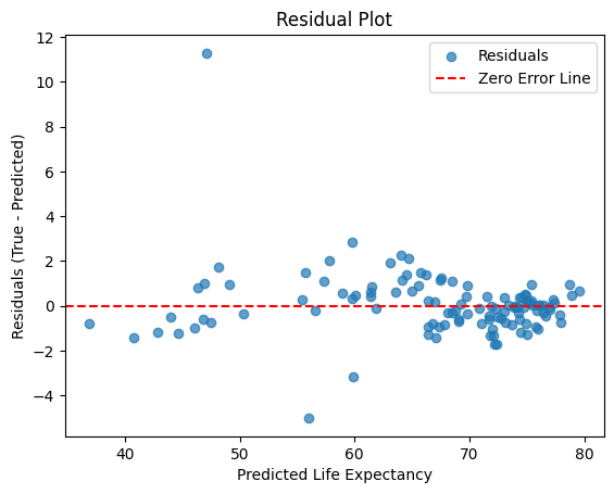
This residual plot shows how far off the model’s predictions are from the actual life expectancy values. Most residuals are scattered closely around the zero error line, indicating reasonably accurate predictions, but the large outlier suggests the model struggled with at least one observation, likely due to unique or missing factors.
# True vs. Predicted Plot
plt.scatter(y_test, y_pred, alpha=0.7, label="Predictions")
plt.plot([y_test.min(), y_test.max()], [y_test.min(), y_test.max()], 'r--', lw=2, label="Perfect Prediction")
plt.xlabel("True Life Expectancy")
plt.ylabel("Predicted Life Expectancy")
plt.title("True vs Predicted Life Expectancy")
plt.legend()
plt.show()
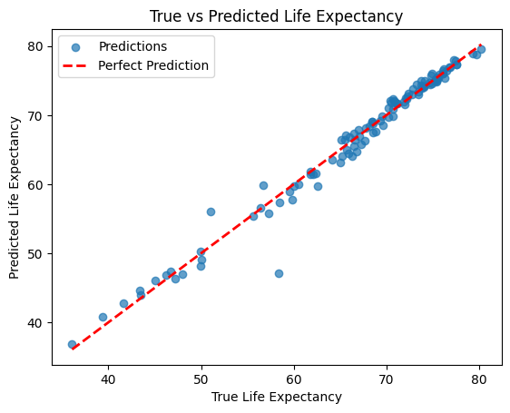
The above plot compares the actual life expectancy values to the model’s predictions. Ideally, points should line up along the 45° line, which would mean the predictions are spot on—any deviations from this line show where the model is off.
Function 4: Mean Squared Error
Accurate predictions are critical when estimating life expectancy, as it helps understand global health and socioeconomic trends. While MAE gives the average deviation, Mean Squared Error (MSE) provides insight into how large errors are squared, emphasizing larger deviations. This makes it particularly useful for penalizing outliers.
Below is an example of how to use the mean_squared_error function with our life expectancy dataset and trained regression model.
# Import the MSE function from our custom package
from matrics_calculator.MSE import mean_squared_error

# Calculate MSE
mse = mean_squared_error(y_test, y_pred)
print(f"MSE: {mse:.2f}")
MSE: 2.22
An MSE of 2.22 means that, on average, the squared difference between the actual life expectancy and the predicted values is approximately 2.22 years. This emphasizes any significant deviations, making it easier to identify where the model’s predictions fall short.
To understand where the model struggles, let’s visualize and compare predictions with the actual data.
# True vs Predicted plot
plt.scatter(y_test, y_pred, alpha=0.7, label="Predictions")
plt.plot(
    [y_test.min(), y_test.max()],
    [y_test.min(), y_test.max()],
    "r--",
    lw=2,
    label="Perfect Prediction",
)
plt.xlabel("True Life Expectancy")
plt.ylabel("Predicted Life Expectancy")
plt.title("True vs Predicted Life Expectancy")
plt.legend()
plt.show()
The True vs. Predicted plot compares the actual life expectancy values to the model’s predictions. Ideally, points should lie along the 45° line. Deviations indicate where the model’s predictions are inaccurate, highlighting possible areas for improvement in the feature set or model architecture.
By combining the numeric output (MSE value) with these visualizations, users can better understand their model’s performance and identify patterns in prediction errors.